


720x720_q85.jpg?v=1787211168)


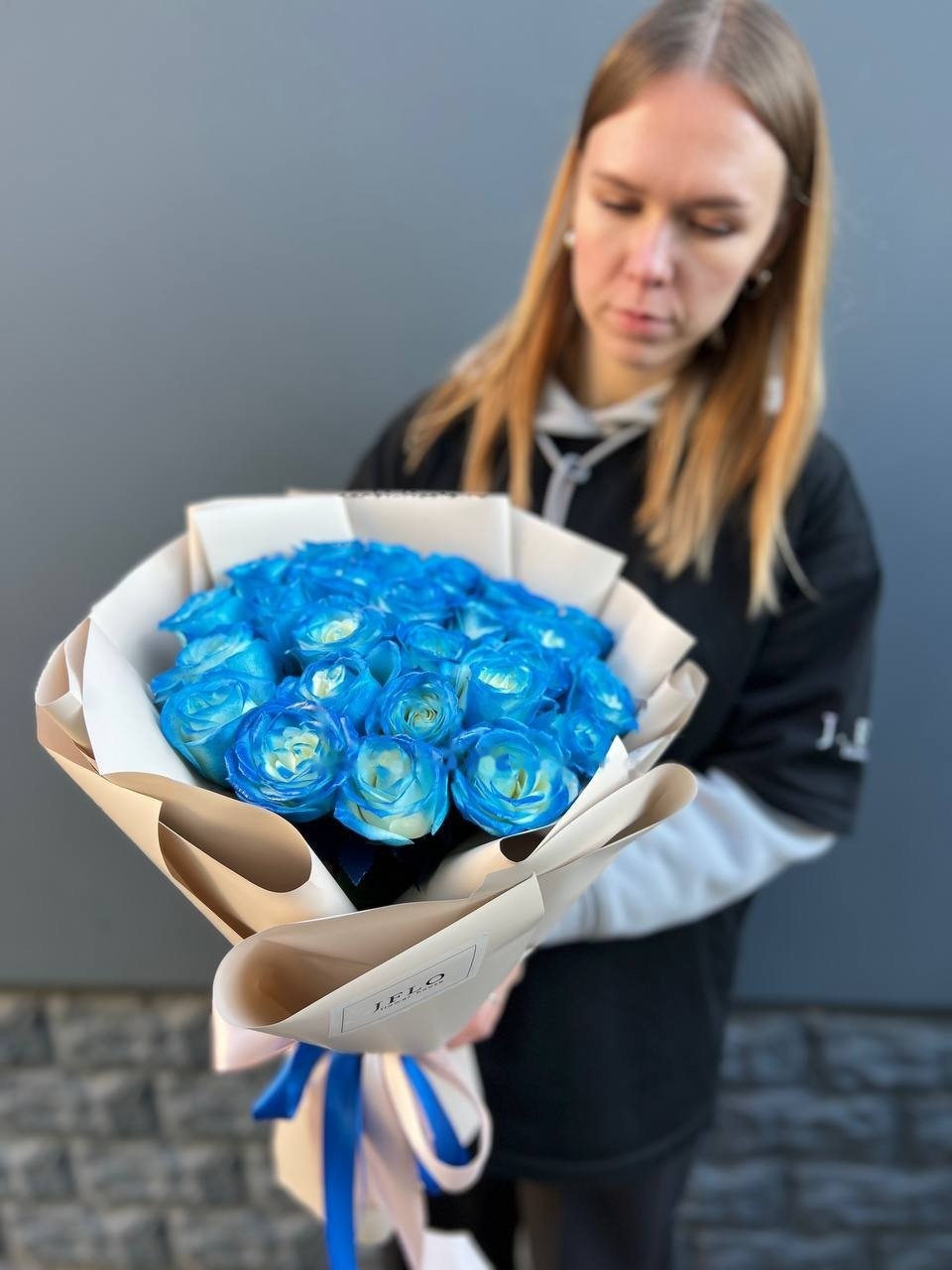
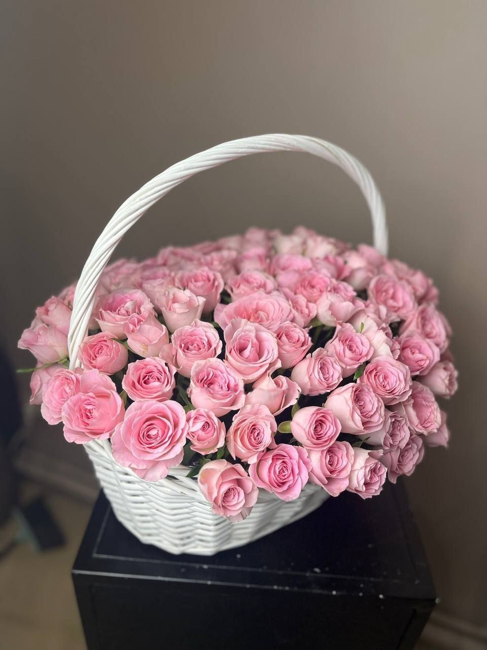
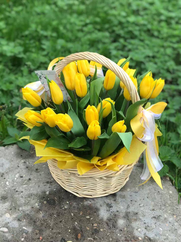
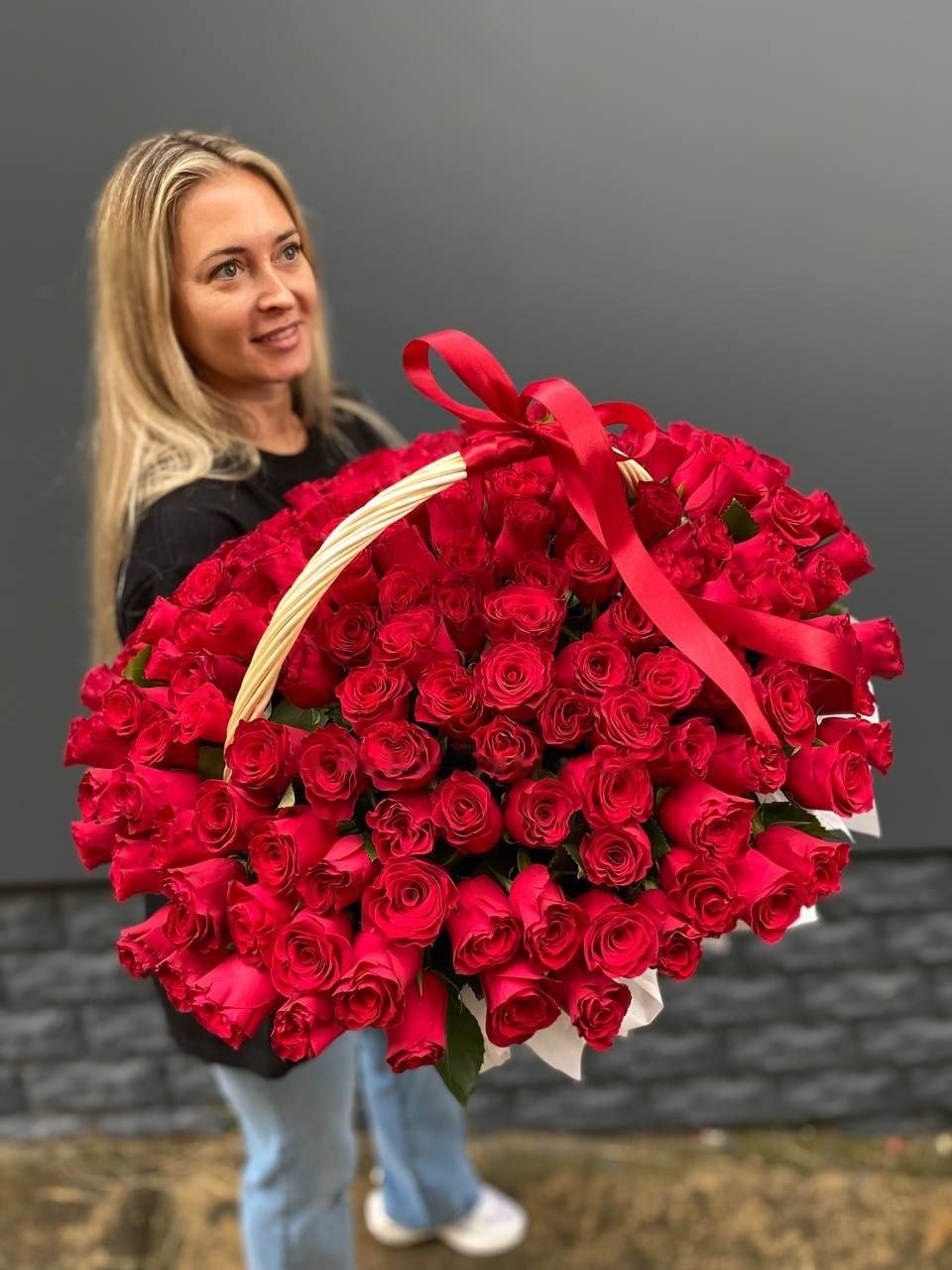
Flower baskets by colour: a scheme has to survive the second week

A hand tied bouquet gets edited. Stems are pulled out as they tire, the rest closes up, and the vase looks tidy again after a minute of work. A basket cannot be edited: every stem sits in a fixed hole in the foam, nothing can be replaced, and whatever the colours do over the following days is what the recipient looks at.
So the scheme has to be chosen for how it ages, not only for how it photographs on day one.
Flowers do not tire at the same speed
Within any mixed arrangement some material is naturally shorter lived than the rest. That is unavoidable and not a fault. What matters is where the tired material sits in the colour scheme, because a fading stem in the middle of a block of its own colour goes unnoticed, while the same stem alone among contrasting neighbours announces itself.
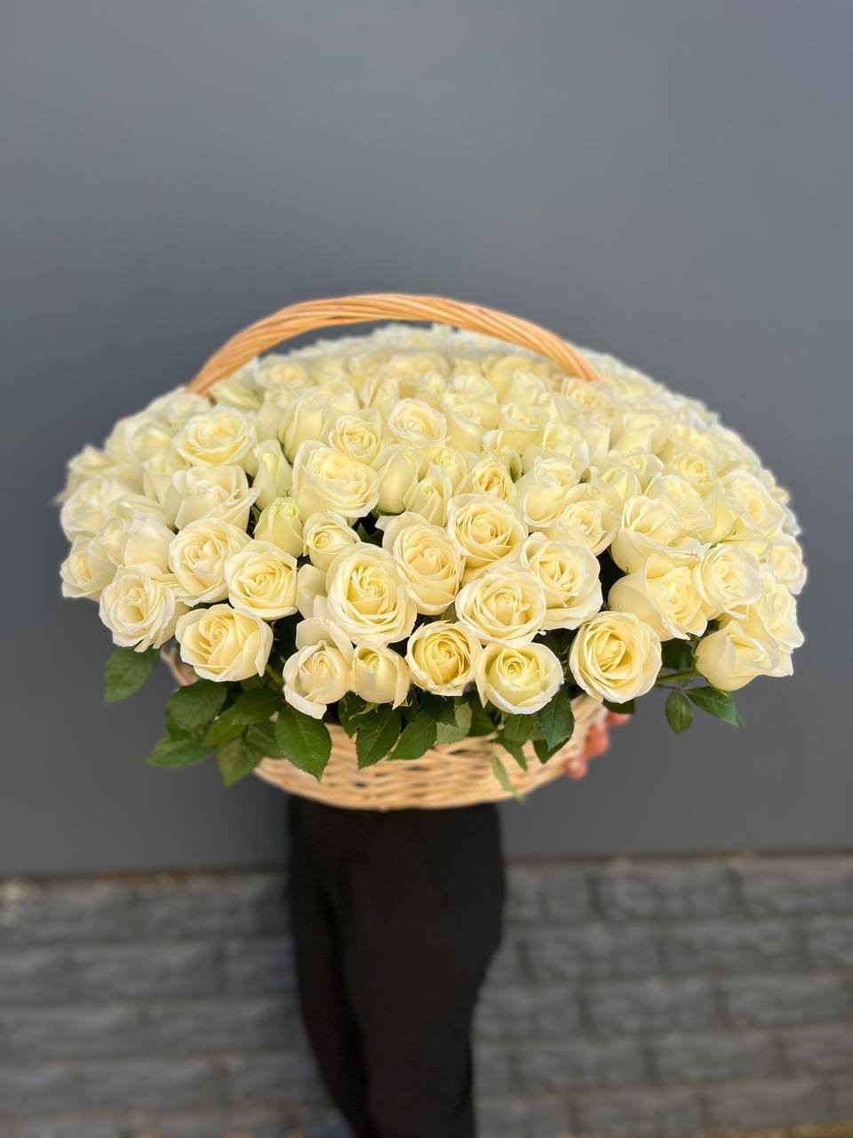
Pale petals show wear first, and not because they are weaker. A browning edge on a white or cream petal reads across a room, whereas the identical edge on a deep red or a strong pink stays invisible for days.
That is the argument for building pale schemes out of fewer, better stems rather than many.
Single colour ages more gracefully
A monochrome basket holds its idea to the end. As individual heads go over, the block simply thins slightly; the colour on show is the same colour it started with, and the shape carries the arrangement even when it is past its best.
A mixed basket loses its balance instead of its density. Take two shades out of five and the remaining three no longer make the picture that was ordered, which is why a scheme built on contrast is the one that dates first.
Colour blocking is the compromise most florists reach for. Same shade set in groups of several stems rather than scattered singly, so a group can thin without a hole appearing in the scheme.
The weave is part of the palette
Natural willow carries a warm reddish tone that cannot be removed from the picture. Cream, peach, coral and terracotta pick that tone up and look settled against it. Cool shades do the opposite: lilac, blue and clean white are read by the eye against a warm neighbour and lose some of their clarity, which is why they are usually set into a whitened, grey or painted frame instead.

Greenery counts as a colour here too, and there is more of it in a basket than in a bouquet of the same size, because it holds the frame of the arrangement.
Light does the rest
Ultraviolet breaks pigment down, and strong colours pay for it soonest: red and purple turn brownish on a sunlit windowsill well before a cream arrangement looks tired. A spot away from direct sun buys a scheme several days of looking the way it was ordered.
Warm dry air costs more than most people expect as well. A radiator or an air conditioning outlet nearby dries the foam surface fast, and thirsty stems lose colour before they lose shape.
Flower baskets by colour are worth matching to the room they are going to rather than to the occasion, since the arrangement will stand in one place for its whole life. Where the room is unknown, as it often is when the address in Copenhagen belongs to someone you have never visited, a warm middle range on a natural weave settles into almost any interior without argument.

