








720x720_q85.jpg?v=1787130774)


720x720_q85.jpg?v=1787130516)
720x720_q85.jpg?v=1787130516)


720x720_q85.jpg?v=1787131158)


Bouquets by colour: which shades are grown and which are made

Colour is the first thing most people decide and the last thing they describe accurately. A florist hears lilac and can picture four different flowers, none of them the one in your head. That gap matters, because the palette a flower market can actually supply is much narrower than the palette a screen can display.
Roses exist in several hundred registered shades. Not one of them is blue.
Pigment, dye and the difference between them
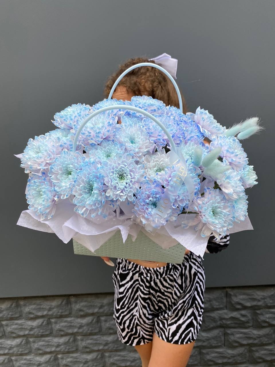
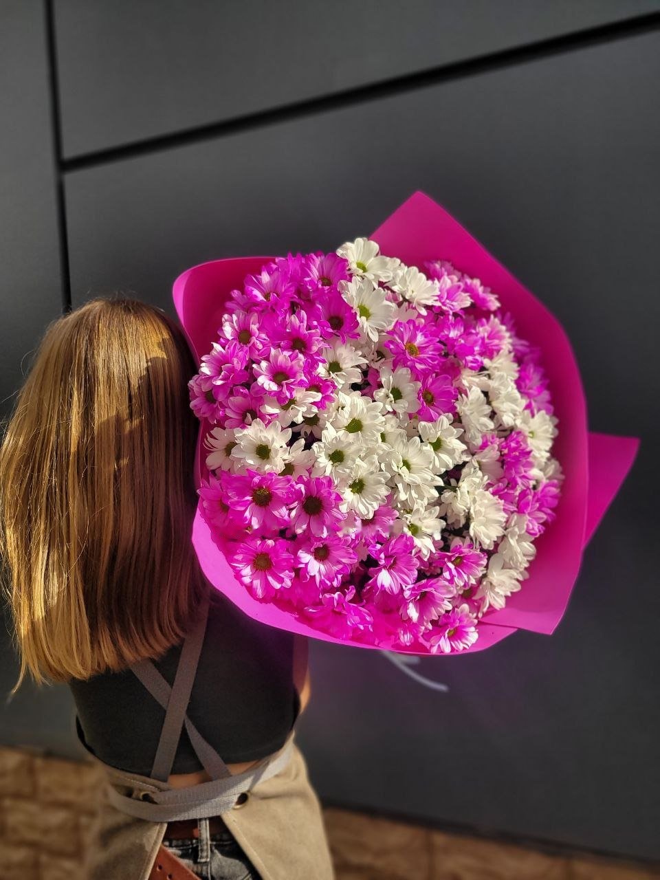
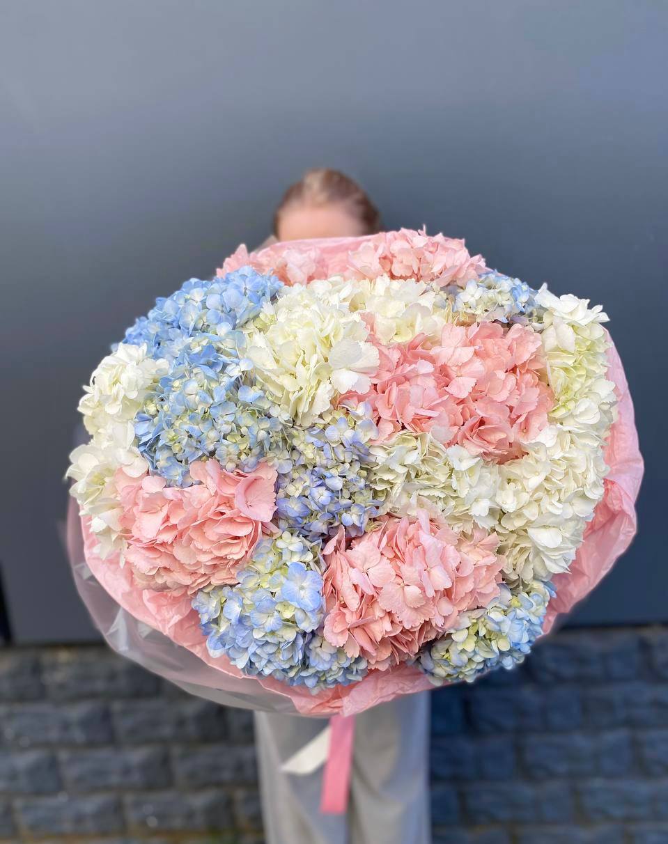
Chrysanthemums, carnations and gerberas have no blue pigment either, and neither has any of them a true black. So every blue, turquoise, jet-black or rainbow stem on the market has been coloured after cutting. Either it stood in tinted water and drew that colour up through its stem, or it took a fine spray across the open petals.
Neither method harms the flower or shortens the vase life in any meaningful way. Both leave traces, though, and a buyer who knows what they are will not be surprised on the third day.
Water-fed colour sits inside the veins. It looks even from a distance, slightly streaky up close, and the cut end of the stem is stained right through. Sprayed colour sits on the surface, comes off on damp fingers, and shows a pale edge wherever a petal was folded when the coat went on.
Green is the odd one out. It is a real pigment, present in chrysanthemums, hydrangeas, some roses and every kind of foliage, which is why a green bouquet holds its tone as it ages while a dyed blue one fades unevenly.
The season behind a shade
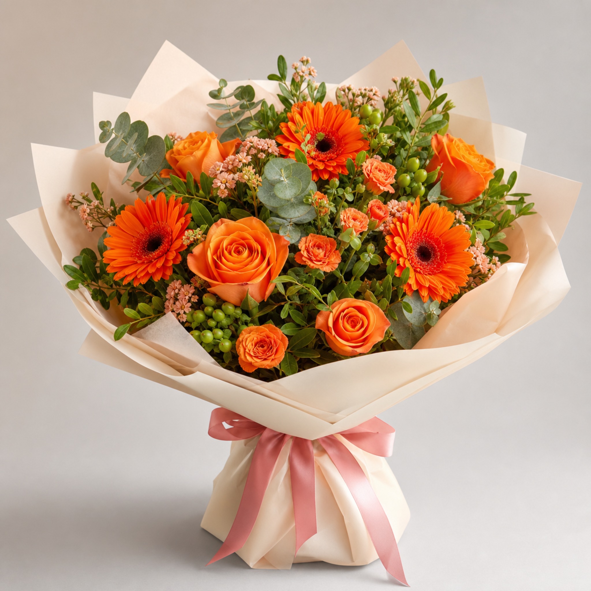
White, cream and soft pink move through greenhouses all year and are the safest bet at short notice. Deep autumn tones arrive with the chrysanthemum and dahlia season and thin out afterwards. Peony pinks come and go with a short window in early summer, and outside it the same shade has to be built from roses or ranunculus instead.
A named shade is therefore a request, not a guarantee. Ask a week ahead if the exact tone carries the meaning of the gift.
Choosing colour for someone you barely know

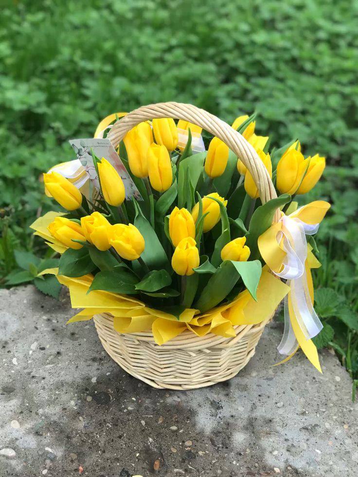
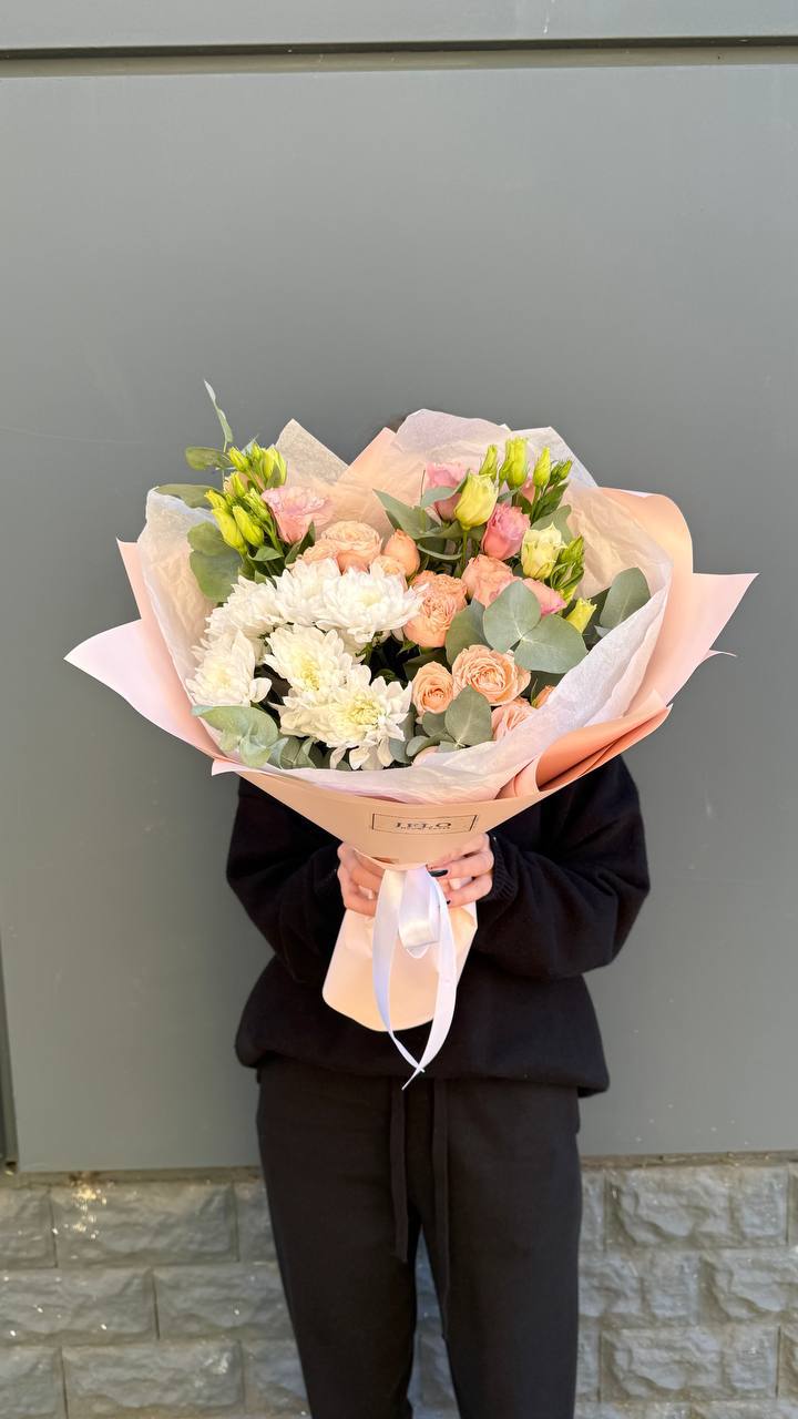
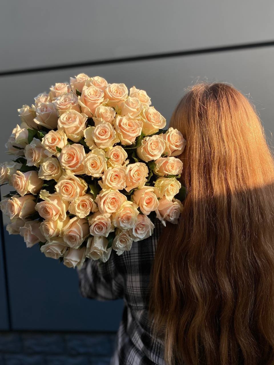
Cream, white and dusty pink read as attention rather than declaration, which is what most work and family occasions need. Red is the only shade that carries one meaning everywhere and cannot be softened by wrapping or by the card. Yellow is warm and slightly risky, since a parting superstition still attaches to it for some recipients, and it costs nothing to sidestep with apricot. Peach sits between the two and rarely offends anyone. Lilac splits opinion sharply, so it suits a recipient whose taste you already know.
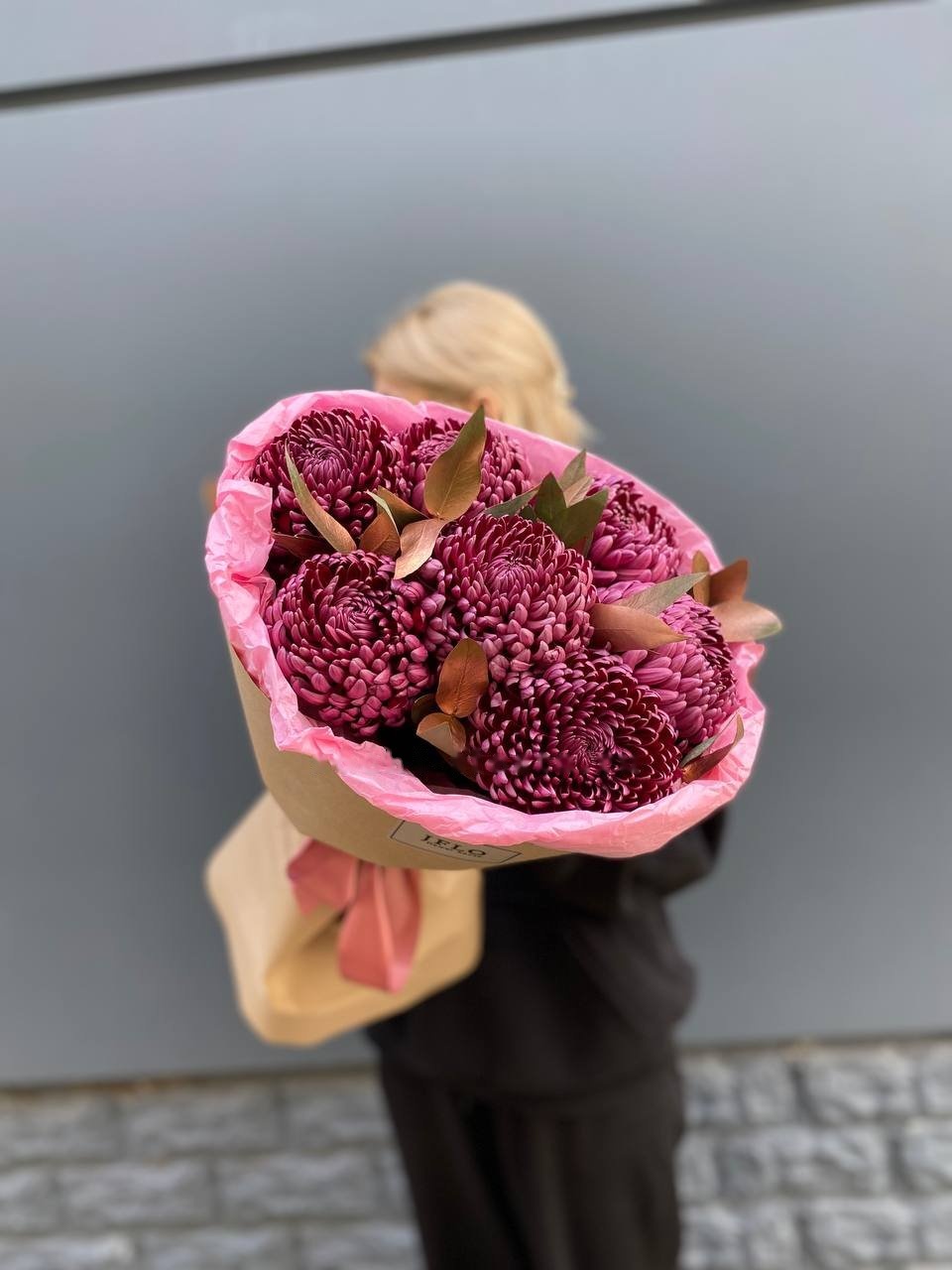
Deep tones are the ones people misjudge most often. Burgundy, plum and aubergine look rich in daylight and turn into a dark mass under a dim hallway lamp, so they suit a bright room and a close look rather than an evening handover in a corridor.
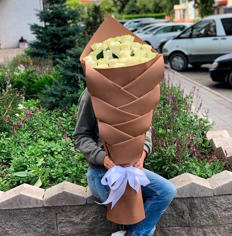
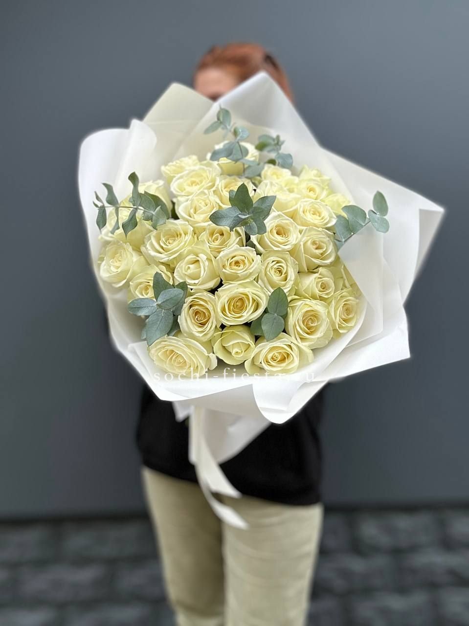
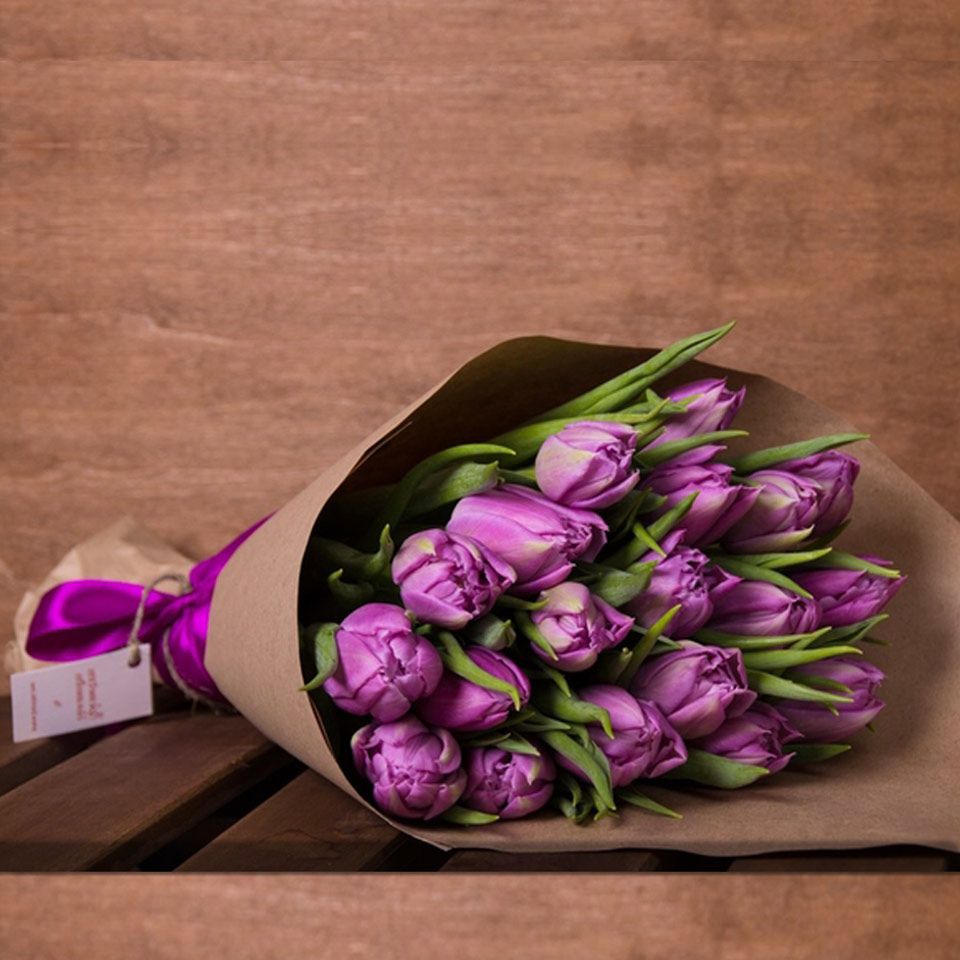
Wrapping is part of the colour decision and not a finishing touch. White paper next to white flowers makes the petals look grey. Black card lifts pastels and swallows anything deep, while warm kraft quietly pulls every cool shade towards brown.
Bouquets by colour work best when the shade is chosen for the room it will stand in and for the light the recipient in Alanya actually has, rather than for the way it looked on a backlit screen.

